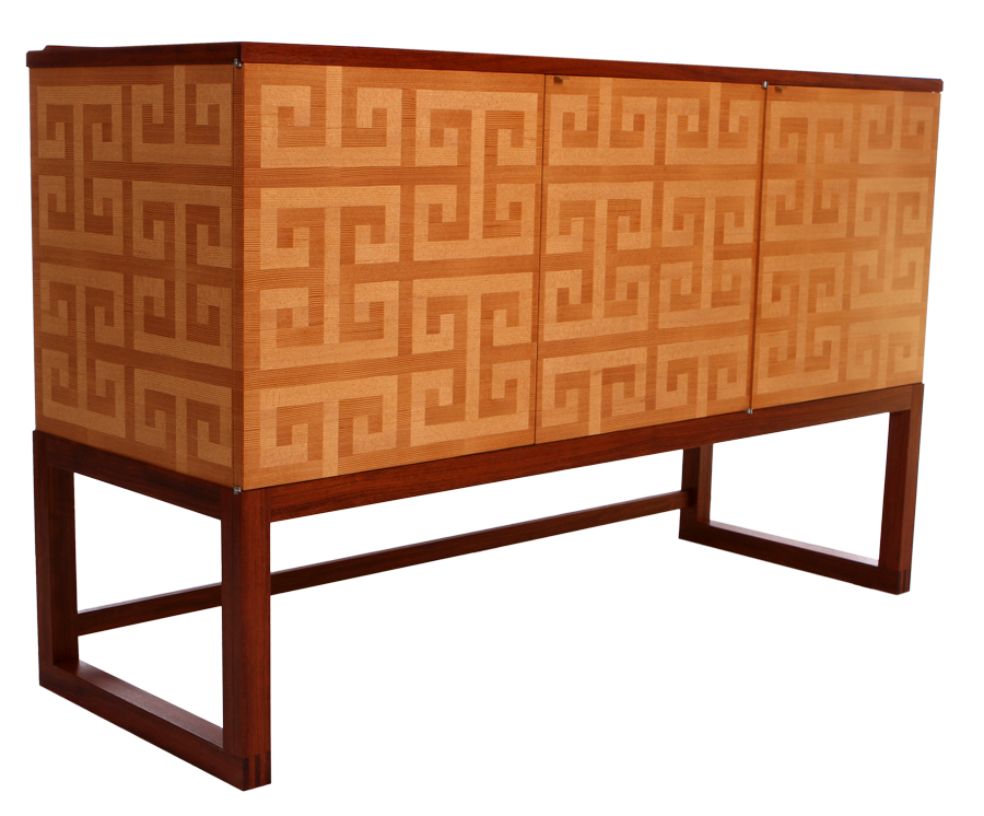
I made a website recently for a friend who is a mega-talented furniture maker. Check out his work. Amazing.
November 2011
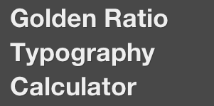 With his popular and beautiful WordPress themes and frameworks, designer Chris Pearson deserves heaps of praise for bringing typographic goodness to the web. Now he’s gone a step further, offering a handy calculator for finding the right font size and line height for your site’s body content.
Check your font: Pearsonified’s Golden Ratio Typography Calculator
P.S. This site uses Pearson’s Thesis framework.
Brilliant!
Key contributors to the evolution of English: the Roman Empire, ze Germans (the Anglos and the Saxons), ze French, the King James Bible, Bill Shakespeare, colonialism, science, ‘merica, capitalism and the Internets. Plus about 350 other languages that English has stolen words from.
I’ve noticed that linguists show a mixture of amusement and annoyance toward grammarians. I think I understand why these two species don’t mix well even though they would seem to be natural allies: linguists see incredible richness, nuance and fluidity in language. Grammarians, on the other hand, see monochromatic rules and sacrosanct strictures.
In a certain sense, grammarians are profoundly uninterested in language, even though they may revere it. For them, English is this fixed and already perfected thing, an inheritance that we must preserve and protect from adulteration; there are rules, and they are to be memorized and followed, not analyzed, questioned or amended. Of course, grammarians are wrong a lot, and can be thuggish and stupidly melodramatic in their piety (imho).
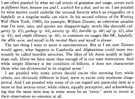
All that said, On Writing Well is an awesome book, and Zinsser’s tone is, on the whole, much warmer and more temperate than you might think given the examples cited in Joseph Williams’ essay ‘The Phenomenology of Error’ (pictured above). Whereas Strunk and White made me afraid to type a sentence, Zinsser actually inspired me to write. Williams’ point still stands, however. Grammarians can be total dicks.
Joseph M. William: The Phenomenology of Error via Lingua Franca
Update: Geoff Nunberg offers an excellent primer on “the politics of ‘prescriptivism'”
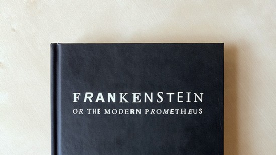
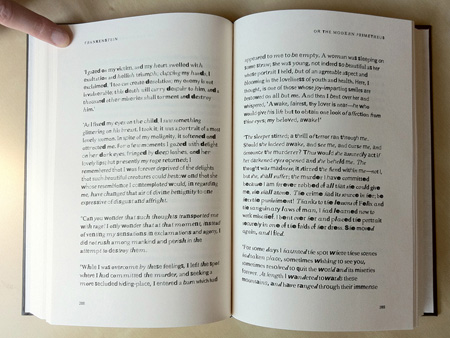
The clever folks at Fathom.info printed a copy of Frankenstein, the Mary Shelly novel, set in unkerned fonts scavenged from PDF files found online. The result is stunning, a testament to the power of type to help tell a story.
The font starts off fairly normal and becomes more fragmented and grotesque as the story progresses, adding “a dimension of anguish” to match the narrative.
Young Frankenfont | Fathom.info
Also, remember that Frankenstein ≠ the Monster. And Frankenstein is pronounced fron•ken•steen. #psa

Of the 141,058 medical codes used for insurance billing purposes, W5803XA denotes “crushed by alligator, initial encounter.”
W5803XS: “Crushed by alligator, subsequent encounter.”
via Harper’s
Ambrose Bierce skewers Oscar Wilde:
That sovereign of insufferables, Oscar Wilde has ensued with his opulence of twaddle and his penury of sense. He has mounted his hind legs and blown crass vapidities through the bowel of his neck, to the capital edification of circumjacent fools and foolesses, fooling with their foolers. He has tossed off the top of his head and uttered himself in copious overflows of ghastly bosh. The ineffable dunce has nothing to say and says it — says it with a liberal embellishment of bad delivery, embroidering it with reasonless vulgarities of attitude, gesture and attire. There never was an impostor so hateful, a blockhead so stupid, a crank so variously and offensively daft. Therefore is the fool enamored of the feel of his tongue in her ear to tickle her understanding.
The limpid and spiritless vacuity of this intellectual jellyfish is in ludicrous contrast with the rude but robust mental activities that he came to quicken and inspire. Not only has he no thoughts, but no thinker. His lecture is mere verbal ditch-water — meaningless, trite and without coherence. It lacks even the nastiness that exalts and refines his verse. Moreover, it is obviously his own; he had not even the energy and independence to steal it. And so, with a knowledge that would equip an idiot to dispute with a cast-iron dog, and eloquence to qualify him for the duties of a caller on a hog-ranch, and an imagination adequate to the conception of a tom-cat, when fired by contemplation of a fiddle-string, this consummate and star-like youth, missing everywhere his heaven-appointed functions and offices, wanders about, posing as a statue of himself, and, like the sun-smitten image of Memnon, emitting meaningless murmurs in the blaze of women’s eyes.
He makes me tired. And this gawky gowk has the divine effrontery to link his name with those of Swinburne, Rossetti and Morris — this dunghill he-hen would fly with eagles. He dares to set his tongue to the honored name of Keats. He is the leader, quoth’a, of a renaissance in art, this man who cannot draw — of a revival of letters, this man who cannot write! This little and looniest of a brotherhood of simpletons, whom the wicked wits of London, haling him dazed from his obscurity, have crowned and crucified as King of the Cranks, has accepted the distinction in stupid good faith and our foolish people take him at his word. Mr. Wilde is pinnacled upon a dazzling eminence but the earth still trembles to the dull thunder of the kicks that set him up.
Edward Tufte’s experience with the iPad’s reminds him why he prefers the tactility of the real world:
One reason I make sculpture is that I have stared long enough at the glowing flat rectangles of computer screens that show only flatland representations of real things. I like to make real things and love the physicality of making sculpture that resides in the physical world of three-space and time. The surfaces of my work often express tool marks and hand marks growing out of the handcraft of artwork production.These marks express the “hand” of the artwork and its makers. When I talk about my sculptures on artist tours I unconsciously run my hands over the surface of the work and, for smaller pieces, pick them up and hold them. These surfaces are complex, luscious, subtle, responsive, warm or cool, and three-dimensional to the touch. All that micro-physical information is made by the hand and is detected by hand and eye when the artwork is seen and touched.
There is no such hand in touchscreen computer devices. The touchscreen has no texture variation, has no physical surface information, is dead flat, reflects ambient light noise, and features oily fingerprint debris when seen at a raking angle. Also the elegant sharp edges that encase many touchscreens require users to desensitize their hands in order to ignore the physical discomfort produced by the aggressive edges. Last year in Cupertino, I yelled at some people about touchscreens that paid precise attention to finger touches from the user but not to how the device in turn touches the hands of the user and produces divot edge-lines in the flesh.
…
There are big engineering issues in creating even book-like tactile experiences on or near screens, since flat images require glowing hard flatland display surfaces, a requirement contrary to tactile experiences. Perhaps there will be a few small steps toward tactility. Maybe tactility will become a feature in the endless feature cycle of devices. Dimensional compression is dimensional compression, however, and even those sentient beings that reside in string-theory N space probably whine that their N – 1 dimensional display device necessary to fit in their N – 1 dimensional pockets fails to capture the rich experience of their real N space.
So instead let us give more time for doing physical things in the real world and less time for staring at and touching the glowing flat rectangle.
Plant a plant, walk the dogs, read a real book, go to the opera.
I’ve had an iPad for a few months now. It’s truly an amazing device and I don’t regret buying it at all. But here’s the thing: I’ve never gotten comfortable actually holding it in my hands. I still have this vague nervousness that I’ll drop it and mar its pristine beauty.
From an aesthetic standpoint it’s a marvel. But from an ergonomic standpoint it’s a bit of a disaster. It’s just not comfortable to hold. Which is a significant failing, imho. Course, maybe I just need a good case…
